In my previous post I researched the history and rules of different magazines, today I will be putting that research into practice, I will be analyzing the design of Fashion, Beauty, and Travel and discover the layout and how it has different appeals for different audiences.
For fahsion I looked over a few issues of Vogue and Elle, they both rely on brand influence. In fahsion magazines you typically notice the overlapping masthead, usually the model's head or hair covers the magazine title to emphasize the famous cover star and to signal the brand recognition. As well to highlight the fashion the page other than the logo. Fashion magazines use elegant fonts to make it look expensive and classic, for example Vogue magazine uses Didot typeface. Fashion magazines usally have lots of "dead space" its used so it doesn't crowd the model and as well to make it look more high-end.


https://www.sheridan.com/magazines-register/the-elements-of-cover-style/
The beauty magazines Allure and Cosmo are the opposite, it's much more energetic and crowded. The beauty shot/ head shot, in beauty its all about the face, to be able to show off skin, makeup, and hair. Puffs are a big factor in beauty magazines, often saying NEW/WINNER, they do this to make the reader feel like they're getting secret insight and deals. Beauty magazines use bright pop of colors, using bright pink, red, and neon specifically to catch your eye while you're walking past a magazine stand.

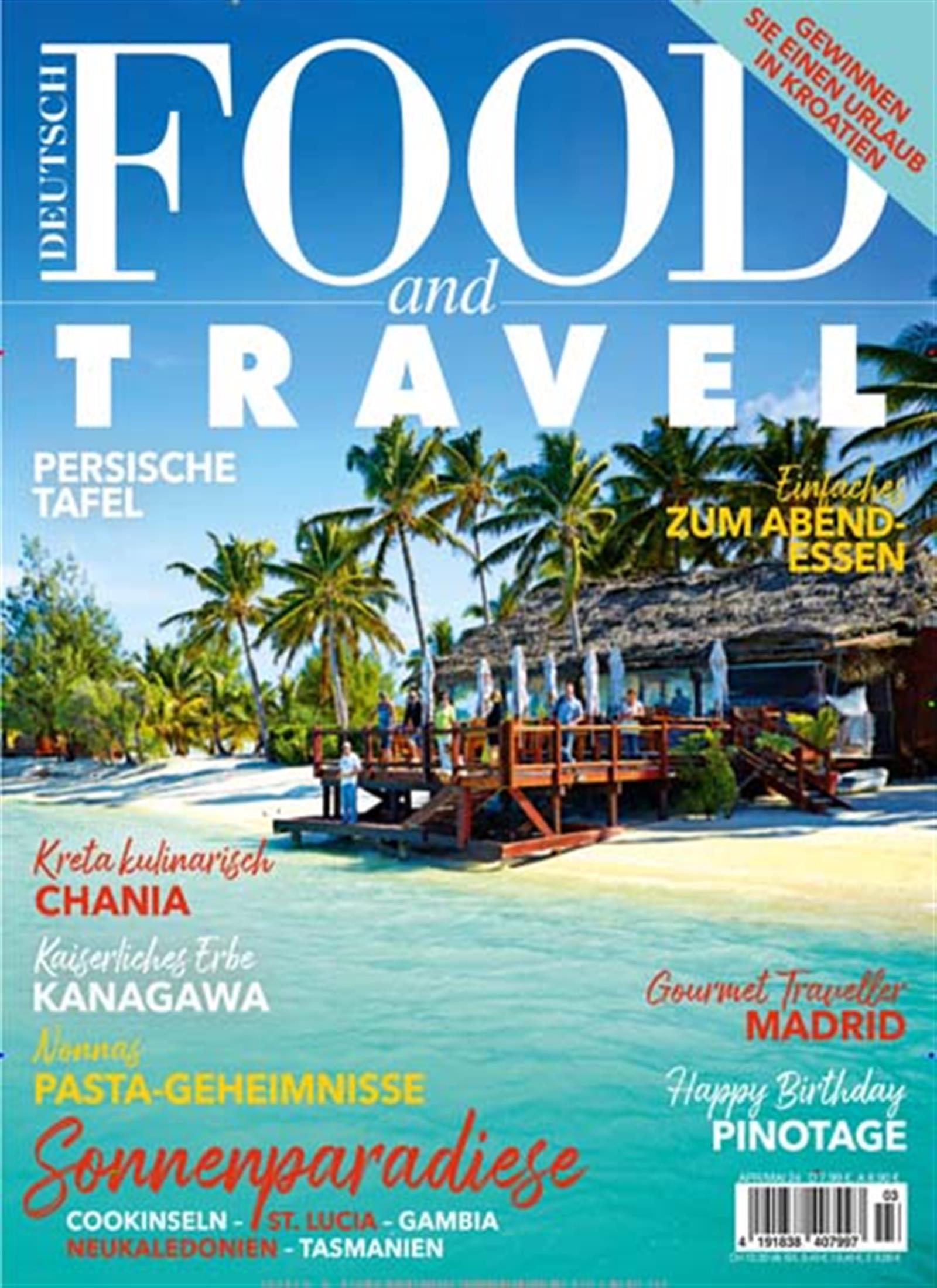
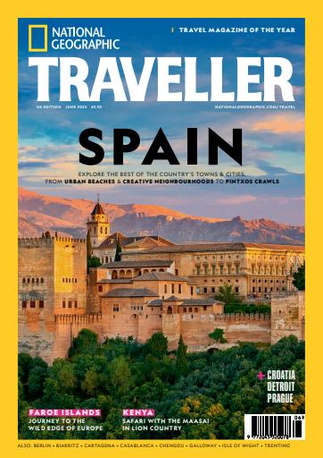
Travel magazines I looked at were Condé Nast Traveler and National Geographic Traveler. Both magazines use immersive photography, usually using one solid image that takes up the entire cover. They use aesthetically appealing photos to bring their audience in and grab their attention quick. They tend to use Sans-Serif fonts to make it look more clean, modern-looking, and also journal-like to get that adventurous feel. For the travel magazines' cover image they use the rule of thirds, sometimes using a mountain, beach, someone on a boat, it is almost never centered directly in the middle, normally is off to the side, making the layout feel more balanced. Placing the image a little more to the right or left gives area to place cover lines or the magazine title without covering parts of the photo.


No comments:
Post a Comment